Sunday, 23 March 2008
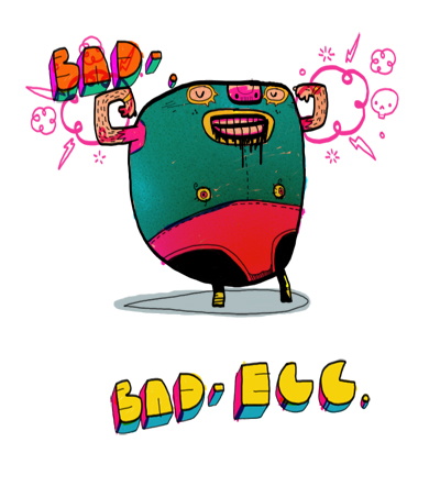
BAD-EGG
Todays egg-based theme inspired me to doodle a egg wrestler. He's warped from years of performance-enhancing drugs, with a bulletproof shell and yolk-stained underpants:


Tuesday, 18 March 2008
Vikings!
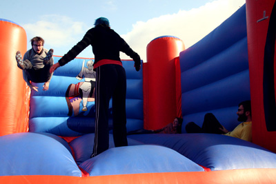
Not many posts from me lately, as I've been racing to get work done, and also just got back from a entertaining holiday in the deepest countryside, where me and some friends hired a cottage, and a bouncy castle. I'm not sure I'm going to be able to live without one now.
Anyway, just before I went away I got a call to do an editorial illustration. I love nothing better than doing some doodles and seeing them floating around the world on bits of paper, but I've been turning down these sort of jobs lately, as I'm so busy animating stuff. But I decided I needed a change for a day, plus the brief specified an army of SWEDISH VIKINGS (two of my favourite things), so I sharpened my Wacom pen and set to work.
So I started off with the rough, I wouldn't normally do a rough for anything I do for myself, as I like to keep everything spontaneous, and full of those weird little ideas you get when "Ad-Libbing". But understandably clients like to have an idea what they are paying for before its complete, plus I needed to work with the designer on how it would fit into the double-page spread. Here it is:

Its really rough and sketchy, but I don't want to get bogged down with too much final detail at this stage. I drew the rough in one single pass, to hopefully keep some of that spontaneity that I'm trying to cling onto. Here's a close-up:
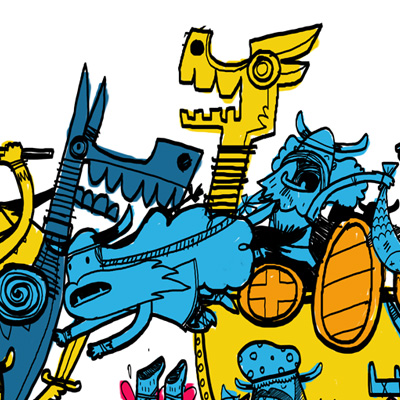
And having got that approved it was full-steam-ahead with the final, which I tried to incorporate a few new ideas into that weren't in the rough stage to keep it fresh, whilst not deviate too far from what the client had actually approved..
Which turned out like this.
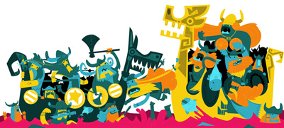
Which is far too small to see properly here, So here's some closeups:
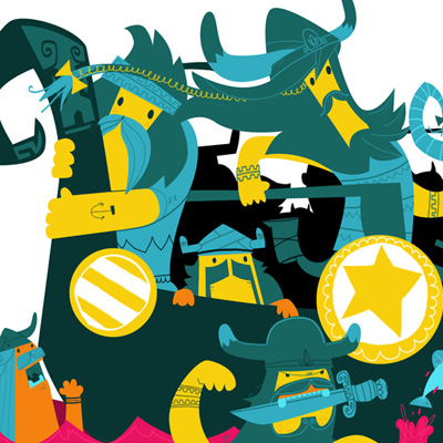
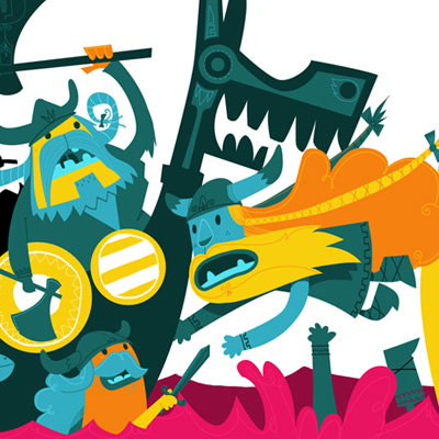
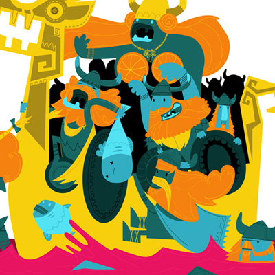
Personally, I think the sketch version maybe has something that the final doesn't, especially when reduced down the restrictive size of my blog. But I'm pleased I managed to combine doodley style (how I wanted it to look) with a slightly more restrained vectory style (how the client wanted it). So everyone is happy. Well apart from the Vikings themselves, who stay perpetually angry, like the crazy, fish-fueled pillage-mongers that they are. And we'll love them all the more for that.

Anyway, just before I went away I got a call to do an editorial illustration. I love nothing better than doing some doodles and seeing them floating around the world on bits of paper, but I've been turning down these sort of jobs lately, as I'm so busy animating stuff. But I decided I needed a change for a day, plus the brief specified an army of SWEDISH VIKINGS (two of my favourite things), so I sharpened my Wacom pen and set to work.
So I started off with the rough, I wouldn't normally do a rough for anything I do for myself, as I like to keep everything spontaneous, and full of those weird little ideas you get when "Ad-Libbing". But understandably clients like to have an idea what they are paying for before its complete, plus I needed to work with the designer on how it would fit into the double-page spread. Here it is:

Its really rough and sketchy, but I don't want to get bogged down with too much final detail at this stage. I drew the rough in one single pass, to hopefully keep some of that spontaneity that I'm trying to cling onto. Here's a close-up:

And having got that approved it was full-steam-ahead with the final, which I tried to incorporate a few new ideas into that weren't in the rough stage to keep it fresh, whilst not deviate too far from what the client had actually approved..
Which turned out like this.

Which is far too small to see properly here, So here's some closeups:


Personally, I think the sketch version maybe has something that the final doesn't, especially when reduced down the restrictive size of my blog. But I'm pleased I managed to combine doodley style (how I wanted it to look) with a slightly more restrained vectory style (how the client wanted it). So everyone is happy. Well apart from the Vikings themselves, who stay perpetually angry, like the crazy, fish-fueled pillage-mongers that they are. And we'll love them all the more for that.
Labels:
character design,
Doodles,
illustration,
magazine,
print,
vikings
Subscribe to:
Comments (Atom)


